写在最前面
初学flutter,以跑起来为主,其他细节慢慢补充
下载与安装(Windows系统)
官网地址: https://dart.dev/
Windows系统两种安装方式
- 通过命令行安装[不推荐]
使用官方提供的软件安装
- 下载地址: http://www.gekorm.com/dart-windows/
- 下载安装完成后,在命令行中输入
dart --version,出现版本号表示安装成功
MAC系统只能通过命令行进行安装
Dart开发工具配置Dart
Dart的开发工具有很多: IntelliJ IDEA WebStorm Atom Vscode等。
Vscode中配置Dart
- 搜索安装
Dart插件 - 搜索安装
code runner以运行文件
Vscode安装完插件后需要重启才能生效
Dart 语法
入口方法
入口方法为main方法
1 | main() { |
无返回值的main方法
1 | void main() { |
注释方式
使用 //、 /// 、/**/ 均能注释
变量与常量
定义变量
dart定义变量时,可以不预先定义变量类型 也可以指定变量类型
不预先定义变量类型使用var进行声明
1 | var str = 'this is var'; |
指定变量类型:
1 | String str = 'this is String'; |
使用了var就不能指定类型,指定了类型就不能使用var
变量名称命名规则
- 变量名必须由数字、字母、下划线和美元符号(
$)组成 - 标识符开头不能是数字
- 标识符不能是保留字和关键字
- 变量的名字区分大小写
- 标识符要见名思意: 变量名称建议用名词,方法名建议用动词
定义常量
使用修饰符const、final进行修饰
const定义的常量值不变,一开始就需要赋值final可以先不赋值,但只能赋值一次final不仅有const的编译时常量的特性,还有运行时常量的特性,调用方法时得到常量值可以用final修饰
1 |
|
数据类型
字符串 (String类型)
字符串的定义方式
- 可以用单引号('')或者双引号定义("")
- 使用三个单引号(''' ''')或者三个双引号(""" """)可定义多行字符串
1 | main() { |
字符串的拼接
使用
$1
2
3
4
5
6
7
8
9
10
11
main() {
var str1 = 'donkey';
var str2 = 'monkey';
print("one: $str1,$str2");
print("two: $str1 $str2");
}输出结果:
1
2one: donkey,monkey
two: donkey monkey使用
+1
2
3
4
5
6
7
8main() {
var str1 = 'donkey';
var str2 = 'monkey';
print("one: " + str1 + "," + str2);
print("two: " + str1 + " " + str2);
}输出结果:
1
2one: donkey,monkey
two: donkey monkey
数值类型(Number型)
int 必须是整型
double 浮点型, 也可赋值整型,但会带上小数点
1 |
|
输出结果:
1 | d: 1.0 |
注: 此处打印时使用print("d: " + d); 会报类型错误
布尔类型
bool值只能为true或false
数组/集合类型 (List)
1 | main() { |
输出结果:
1 | [abc, aaa, ccc] |
字典类型(Map)
1 | main() { |
输出结果:
1 | {name: 张三, age: 18} |
数据类型的判断
使用关键词is判断数据类型
运算符 (与java一样 先跳过)
循环语句 (与java一样 先跳过)
集合 (与java一样 先跳过)
方法的定义
基本格式
1 | 返回值类型 方法名称(参数1,参数2,[可选参数1,可选参数2],....) { |
箭头函数
箭头函数内只能写一行代码
Dart中类和对象
Dart中没有public private protected 等修饰符,若要将属性或方法私有化可以使用_
Flutter环境配置
windows上搭建Flutter Android运行环境
- 安装配置JDK
- 安装Android Studio
- 下载配置Flutter SDK
配置Flutter镜像
build.gradle中將google()jcenter()注釋掉,換成阿里鏡像地址:1
2
3maven{ url 'https://maven.aliyun.com/repository/google' }
maven{ url 'https://maven.aliyun.com/repository/jcenter' }
maven{url 'http://maven.aliyun.com/nexus/content/groups/public'}
Flutter (V 1.9.1 2019年9月更新版)
跟随官网开始学(https://flutter.dev/docs/get-started/codelab)
说明
以下代码均为VsCode中完成,光标移动到终端后可执行一些快捷命令:
r/R热部署项目p显示网格o切换平台(IOS/Android平台切换)q退出
第一步 初始化Flutter app
- 导入
material.dartUI库,material官网:https://material.io/ 书写入口方法并调用
1
void main() => runApp(MyApp());
main()表示入口方法=>箭头函数,后面内容为一行时使用,一种语法糖MyApp()自定义的方法
声明自定义方法
1
2
3
4
5
6
7
8
9
10
11
12
13
14class MyApp extends StatelessWidget {
@override
Widget build(BuildContext buildcontext) {
return MaterialApp(
title: 'This is for my note!',
home: Scaffold(
appBar: AppBar(title: Text('Demo Page'),),
body: Center(
child: Text('Hello World'),
),
),
);
}
}上述demo创建了一个
Material app,Material是遵循移动端和网页端标准的一种视觉设计语言,官网为https://material.io/,Flutter中提供了丰富的Material组件自定义的
MyApp必须继承StatelessWidget以将自己定义为组件,在Flutter中,万物皆组件,例如:alignment、padding、layoutStatelessWidget是抽象类,因此要重写build方法,重写需要加上@override注释,build方法中必须要有参数BuildContextScaffold是Material中的一个组件,提供了自定义appbar、title、body属性来维持home页面的组件树,Scaffold的子组件可以很复杂,用于构建所需界面一个组件的主要方法就是提供
build()方法来将其它或者更低级的组件封装来定义界面显示上述demo中的
body是由Center组件和其子组件Text组成的,Center组件表示将其子组件设置为居中屏幕对齐
第二步 引用外部包
此步骤中,使用一个外部开源包english_words,此包中含有常用英语以及一些实用短语。
english_words包以及其它开源包可在https://pub.dev/中获取
pubspec文件负责管理Flutter APP中的依赖和assets。打开项目根目录下的pubspec.yaml文件,将english_words及其版本添加到依赖列表中:1
2
3
4
5
6
7
8
9
10
11
12
13
14
15
16name: flutter_app
description: A new Flutter application.
environment:
sdk: ">=2.1.0 <3.0.0"
dependencies:
flutter:
sdk: flutter
cupertino_icons: ^0.1.2
# 此处添加依赖
english_words: ^3.1.5
dev_dependencies:
flutter_test:
sdk: flutter依赖添加完成后,VSCode会自动导包,并在根目录下的
pubspec.lock文件中自动生成对应外部包的相关信息。如果使用的是Android Studio则需要点击Packages get进行导包,无论使用哪种,只要控制台出现了Running "flutter pub get" in 项目名...就表示已将外部包成功导入项目中1
2
3
4
5
6
7english_words:
dependency: "direct main"
description:
name: english_words
url: "https://pub.dartlang.org"
source: hosted
version: "3.1.5"在
lib/main.dart文件中引入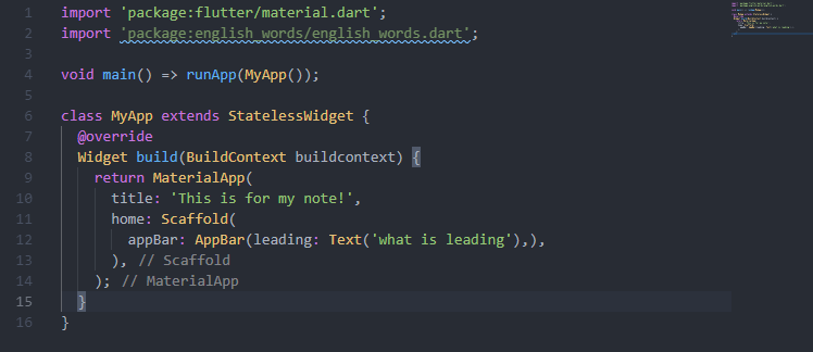
引入时编辑器会提示此包还未使用、
使用
english_words生成文字代替上述demo中的Hello World1
2
3
4
5
6
7
8
9
10
11
12
13
14
15
16
17
18
19
20
21
22import 'package:flutter/material.dart';
import 'package:english_words/english_words.dart';// 导包
void main() => runApp(MyApp());
class MyApp extends StatelessWidget {
@override
Widget build(BuildContext buildcontext) {
// 注入
final wordPair = WordPair.random();
return MaterialApp(
title: 'This is for my note!',
home: Scaffold(
appBar: AppBar(title: Text('Demo Page'),),
body: Center(
child: Text(wordPair.asPascalCase),// 使用
),
),
);
}
}注:
wordPair.asPascalCase中PascalCase表示将每个单词的首字母大写,如将helloworld写成HelloWorld上述代码每热部署(Android Studio快捷键
ctrl+s; VScode在终端键入r)一次,界面就会随机显示不同的词语。因为该词语是在build方法中生成的,每启动一次项目或切换平台时,MaterialApp就会重新进行渲染。
第三步 添加一个有状态的组件
Stateless组件是不可变的,即其所有属性都无法改变——所有值都为final。
Stateful组件的状态在组件的生命周期内可变化。实现一个有状态的组件至少需要两个类
1) StatefulWidget类
2) State类
创建一个State类的对象StatefulWidget
StatefulWidget类本身是不可变的,但State类在组件的生命周期中会一直存在
在此步骤中,会添加一个有状态的组件RandomWords继承新创建父类RandomWordsState,然后就能在无状态组件MyApp中作为child来使用RandomWords了。
在
main.dart中创建有状态类RandomWordsState1
2
3class RandomWordsState extends State<RandomWords> {
}State<RandomWords>表示声明一个泛型为RandomWords的通用类State。App中大多数的逻辑和状态都存在这,这里表示状态为RandomWords的组件。这个类将保存随着用户滚动而无限增长的生成的单词对, 以及喜欢的单词对,用户通过重复点击心形 ❤️ 图标来将它们从列表中添加或删除。(啥玩意儿?没懂)RandomWordsState依赖于RandomWords类在
main.dart中添加有状态的RandomWords组件。1
2
3
4class RandomWords extends StatefulWidget {
@override
RandomWordsState createState() => RandomWordsState();
}添加完成后,编辑器会提示
RandomWordsState缺少build方法,接下来就是通过将MyApp中的代码移动到RandomWordsState中,为RandomWordsState添加build方法。在
RandomWordsState中添加build方法1
2
3
4
5
6
7
8class RandomWordsState extends State<RandomWords> {
@override
Widget build(BuildContext buildContext) {
final wordPair = WordPair.random();
return Text(wordPair.asPascalCase);
}
}修改MyApp中生成随机文字部分的代码
1
2
3
4
5
6
7
8
9
10
11
12
13
14
15class MyApp extends StatelessWidget {
@override
Widget build(BuildContext buildcontext) {
return MaterialApp(
title: 'This is for my note!',
home: Scaffold(
appBar: AppBar(title: Text('Demo Page'),),
body: Center(
child: RandomWords(),
),
),
);
}
}重启App。
第四步 创建无限滚动的ListView
在此步骤中,你将RandomWordsState扩展成展示词语的列表。用户滚动屏幕,该列表将无限展示词语。
ListView的builder构造函数工厂可以根据需求快速创建列表。
在
RandomWordsState中创建一个_suggestions列表来保存推荐的成语。同时创建一个_biggerFont变量来使字体变大。1
2
3
4
5
6
7
8
9
10
11class RandomWordsState extends State<RandomWords> {
final _suggestions = <WordPair>[];
final _biggerFont = const TextStyle(fontSize: 18);
@override
Widget build(BuildContext buildContext) {
final wordPair = WordPair.random();
return Text(wordPair.asPascalCase);
}
}注: 在Dart语法中,前缀用
_表示私有接下来为
RandomWordsState类添加方法_buildSuggestions(),此方法用于创建显示推荐的词语。ListView类中提供了属性itemBuilder,这是一个工厂匿名回调函数,含有两个参数:BuildContext和迭代器i。迭代器从0开始递增,每生成推荐的一次单词对就会自增两次,一次用于ListTile,一次用于Divider。此模式能随着用户的滚动无限出现单词对。在
RandomWordsState类中添加_buildSuggestions()方法1
2
3
4
5
6
7
8
9
10
11
12
13
14Widget _buildSuggestions() {
return ListView.builder(
padding: const EdgeInsets.all(16),
itemBuilder: (context, i ) {
if(i.isOdd) return Divider();
final index = i ~/ 2;
if(index >= _suggestions.length) {
_suggestions.addAll(generateWordPairs().take(10));
}
return _buildRow(_suggestions[index]);
},
);
}itemBuilder每产生一对单词对就会被回调一次,并将每对单词对放入ListTile行中。偶数行添加ListTile行;奇数行添加Divider组件将每对单词分开。需要注意的是,Divider在小屏上看起来可能不太明显if(i.isOdd) return Divider();表示在ListView的每一行之前加上1像素的分割线final index = i ~/ 2;表达式~/表示取i/2结果的整型,向下取整。例如:i为1,2,3,4,5时,得到的结果分别为0,1,1,2,2。此处用于计算ListView中减去分割线后实际的单词对数量。如果是建议列表中最后一个单词对,接着再生成10个单词对,然后添加到建议列表。
_buildSuggestions()方法每生成一对单词对就会调用一次_buildRow。_buildRow用于在ListTile中显示新的单词对以使下一步中每行看起来更漂亮
在
RandomWordsState中添加_buildRow方法1
2
3
4
5
6
7
8Widget _buildRow(WordPair wordPair) {
return ListTile(
title: Text(
wordPair.asPascalCase,
style: _biggerFont,
),
);
}更新
RandomWordsState类中的build方法,使用_buildSuggestions()代替直接调用单词生成库。脚手架(Scaffold)实现了基本的Material设计视觉布局。将body中的内容改成:1
2
3
4
5
6
7@override
Widget build(BuildContext buildContext) {
return Scaffold(
appBar: AppBar(title: Text('Infinity scroll word pairs')),
body: _buildSuggestions(),
);
}
更新
MyApp类中build方法,修改title并将home改成RandomWords组件1
2
3
4
5
6
7
8
9
10class MyApp extends StatelessWidget {
@override
Widget build(BuildContext buildcontext) {
return MaterialApp(
title: 'Startup Name Generator',
home: RandomWords(),
);
}
}重启项目即可查看结果
Flutter内置组件
基本结构
MaterialAPP组件作为根组件,具有home属性,home属性调用Scaffold组件
实例化类时,关键字new可以省略。
Scaffold组件
appBar顶部导航栏
body页面内容
bottomNavigationBar底部导航栏
floatingActionButton右下角浮动按钮
drawer、endDrawerdrawer左侧侧边栏endDrawer值类型为
Drawer,详见Drawer组件
Text组件
属性写在Text()中,内容为必填,还有很多可选参数。例如style用来设置文本的样式,值需要使用内置组件TextStyle,TextStyle中可以设置字体大小、颜色等文字相关样式
Flutter中的文本都不能直接写,必须使用Text进行封装
textAlign(文本对齐方式)TextAlign.center居中TextAlign.left左对齐TextAlign.right右对齐TextAlign.justify两端对齐
textDirection(文本方向)TextDirection.ltr从左到右TextDirection.rtl从右到左
overflow文本溢出后的处理方式TextOverflow.ellipsis溢出部分用...代替TextOverflow.fade文字溢出,从上往下为渐变效果TextOverflow.clip溢出部分裁剪(默认)
textScaleFactor字体显示倍率相对于谁的倍率?父元素?
maxLines文字最大显示行数style字体样式设置值需要用
TextStyle进行封装,可设置字体样式decoration文字装饰线TextDecoration.overline上划线TextDecoration.lineThrough中划线(删除线)TextDecoration.underline下划线TextDecoration.none无装饰(默认)
decorationColor文字装饰线颜色decorationStyle文字装饰线样式decorationThickness文字装饰线粗细color字体颜色backgroundColor(文字填充色)fontSize(字体大小)默认为14像素,若设置了字体显示倍率
textScaleFactor,则渲染出来的字体大小 =fontSize*textScaleFactorfontWeight(字体粗细)FontWeight.bold加粗 (w700)FontWeight.normal正常(默认 w400)FontWeight.wxxxxxx为自定义加粗数值
fontStyle(字体样式是否倾斜)FontStyle.italic字体倾斜
letterSpacing(字间距,常用于中文字体)wordSpacing(单词间距)
以下以后慢慢研究
textBaselineheightlocaleforegroundbackgroundshadowsfontFeaturesdebugLabelfontFamilyfontFamilyFallbackpackage
1 |
|
Container组件/容器组件
作用类似于div
常用属性(键值对):
width、height宽度和高度,此宽高将
padding的值包含在内,相当于CSS中的填充盒宽高不设置宽高时,
Container会自动充满屏幕宽高的取值类型定义为了
double,好几个视频老师强调如果是整数也需要写成浮点型,但实际写成int型也能执行,有可能是版本更新的原因,暂不深究alignment(内容对齐方式)alignment: Alignment.topLeft值为Alignment类型,取值一般为以下Alignment.topLeft上部靠左对齐Alignment.topCenter上部居中对齐Alignment.topRight上部靠右对齐Alignment.center居中对齐Alignment.bottomLeft下部靠左对齐Alignment.bottomCenter下部居中对齐Alignment.bottomRight下部靠右对齐
padding(内边距)默认值为0,类型为
EdgeInsetsEdgeInsets.all(10)上下左右内边距均为10EdgeInsets.fromLTRB(left, top, right, bottom)左上右下分别设置内边距
margin(外边距)基本用法参见
paddingcolor(背景填充色)color: Colors.pink此背景色填充范围涵盖
padding,相当于CSS中的填充盒取值为
Color类Colors.内置颜色单词框架内置颜色Color.fromARGB(a, r, g, b)a、r、g、b分别表示透明度、红、绿、蓝,类型均为intColor.fromRGBO(r, g, b, opacity)opacity表示透明度,类型为double,其他均为int
color实际上是BoxDecoration(color: color)的简写,因此设置了这里的颜色就不能设置decoration中的任意color(例如border中的颜色),否则执行会报错:Cannot provide both a color and a decorationdecoration(边框及背景颜色)1
2
3
4
5
6
7decoration: BoxDecoration(
color: Colors.pink,
border: Border.all(
color: Colors.blue,
width: 20
)
)decoration取值为BoxDecoration类,可以设置边框样式及背景填充色decoration也可设置背景色为渐变,写法如下:1
2
3
4
5
6
7
8
9
10
11
12
13
14
15
16
17
18body: Center(
child: Container(
child: new Text('Flutter盒模型', style: TextStyle(fontSize: 40.0)),
alignment: Alignment.topRight,
width: 300,
height: 300,
// color: Colors.pink,
padding: const EdgeInsets.fromLTRB(10, 20, 30, 40),
margin: const EdgeInsets.all(10),
decoration: new BoxDecoration(
gradient: const LinearGradient(
colors: [Colors.pink,Colors.purple,Colors.white]
),
border: Border.all(width: 6,color: Colors.lightBlue)
),
)
),foregroundDecoration(暂不研究)constraints(暂不研究)transform(旋转Container)类似CSS3中的
transform属性,待深究child(子元素) 此部分待考究,先往下学Container的子元素(大概要称为子组件?)不设置
child和constraints时,内容会自动撑满可用空间。若未设置宽高值,可用空间为整个父类;
若设置了宽高且未设置
constraints时,可用空间为所设置的范围内若只设置宽或高,不设置
constraints时,未设置的那部分会自动撑满
image(图片组件)
为图片添加滤镜(图片混合模式)
Image.network添加网络图片src直接填写,不用封装成字典形式,除src可以直接填写以外,其他属性都要使用字典样式alignment图片对齐方式colorcolorBlendMode联合使用 用于将图片和背景色混合1
2
3
4
5child: new Image.network(
'https://w.wallhaven.cc/full/dg/wallhaven-dgv8qo.png',
color: Colors.greenAccent,
colorBlendMode: BlendMode.darken,
)fit控制图片在容器中显示的效果(拉伸、 挤压等),使用
BoxFit类封装BoxFit.fill充满父容器BoxFit.fitHeight高度方向拉伸充满父容器BoxFit.fitWidth宽度方向拉伸充满父容器BoxFit.contain全图显示,保持原比例,可能会有空隙BoxFit.cover充满父容器且保持原比例,可能会有部分内容被裁切
repeat图片在容器中的平铺效果,默认只显示一张图片
ImageRepeat.repeatYY方向平铺ImageRepeat.repeatXX方向平铺
圆角图片实现的两种方式
使用
Container的圆角属性borderRadius和image1
2
3
4
5
6
7
8
9
10
11
12
13
14
15
16
17
18
19
20
21
22
23class MyApp extends StatelessWidget {
@override
Widget build(BuildContext context) {
return MaterialApp(
home: Scaffold(
appBar: AppBar(title: Text('I am learning Container')),
body: Container(
width: 300,
height: 300,
decoration: BoxDecoration(
color: Colors.pinkAccent,
borderRadius: BorderRadius.circular(150),// 指定弧度为宽高的一半就能变成圆形
image: DecorationImage(
image: NetworkImage('https://w.wallhaven.cc/full/vm/wallhaven-vmg8r3.jpg'),
fit: BoxFit.cover
)
),
),
),
theme: ThemeData(primaryColor: Colors.lime),
);
}
}使用
ClipOval组件ClipOval会自动子图片设置弧度,若要设置圆形的图片,需要设置图片的宽高的fit属性,以保证每一张图片都为圆形1
2
3
4
5
6
7
8
9
10
11
12
13
14
15
16
17
18
19
20class MyApp extends StatelessWidget {
@override
Widget build(BuildContext context) {
return MaterialApp(
home: Scaffold(
appBar: AppBar(title: Text('I am learning Container')),
body: Container(
child: ClipOval(
child: Image.network('https://w.wallhaven.cc/full/42/wallhaven-4277l6.jpg',
height: 100,
width: 100,
fit: BoxFit.cover
),
),
),
),
theme: ThemeData(primaryColor: Colors.lime),
);
}
}
引入本地图片
一般建议存放图标等内容
在根目录中新建文件夹
images,在images下创建子文件夹2.0x、3.0x、4.0x… 官网要求必须有2.0x和3.0x将图片复制到上面新建的每一个子文件夹中
Flutter项目运行在手机上时会根据不同屏幕的分辨率加载不同文件夹下对应的图片,因此必须按照上述步骤配置多个文件夹
在
pubspec.yaml文件中的assets配置图片路径1
2
3assets:
- images/a_dot_burr.jpeg
- images/a_dot_ham.jpeg引入本地图片时使用
Image.asset来设置图片地址,其他属性设置与Image.network相同
更正:本地图片的文件夹不需要按照步骤1、2中所说的方式定死,只要在pubspec.yaml文件中配置好自定义的文件简爱就可以了,上述步骤可能是老版本限制
列表组件 ListView
可用于新闻列表。Fluter中提供了五种常见的列表:垂直列表、垂直图文列表、水平列表、动态列表、矩阵式列表
列表组件中的参数
children列表中的元素,使用
<Widget>[]封装,<Widget>[]中可以添加任何组件,如Container()Image.network(src)等,但一般都是配合ListTile组件使用ListTile参数官方文档:
A single fixed-height row that typically contains some text as well as a leading or trailing icon.title标题subtitle二级标题leading列表前图标:Icon(Icons.内置图标名);Icon()中还可以设置其他属性,如图标大小、颜色等,可以以后研究trailing列表末尾图标,设置同leading
leading和trailing还可以使用Image.asset()设置图片
padding列表整体的内边距scrollDirection列表方向默认为垂直列表,将
scrollDirection设置成为Axis.horizontal时,变为水平列表但此处有坑,当children为ListTile时,无法设置ListTile的宽度,此时若设置成为水平列表则会报错BoxConstraints forces an infinite width。水平列表无法使用
ListTile??需要研究下ListTile是个啥
动态列表
通过循环语句实现动态列表
在同一类中直接获取数组
自定义一个私有方法返回一个数组,返回类型必须为
List<Widget>调用自定义方法
1
2
3
4
5
6
7
8
9
10
11
12
13
14
15
16
17
18
19
20
21
22
23
24
25
26class MyApp extends StatelessWidget {
List<Widget> _getData() {
List<Widget> list = new List();
for(var i=0; i<20; i++) {
list.add(ListTile(title: Text('这是第$i个列表')));
}
return list;
}
@override
Widget build(BuildContext context) {
return MaterialApp(
home: Scaffold(
appBar: AppBar(title: Text('I am learning Container')),
body: Container(
child: ListView(
children: _getData()
),
)
),
theme: ThemeData(primaryColor: Colors.lime),
);
}
}
导入外部文件中的数据
假设有外部数据文件
data/list.dart如下:1
2
3
4
5
6
7
8
9
10
11
12
13
14
15
16
17
18
19
20
21
22
23
24
25
26
27
28
29
30
31
32List listData = [
{
"title": "myhome",
"author": "lalaby",
"imageUrl": "https://w.wallhaven.cc/full/nk/wallhaven-nk1gkd.jpg"
},
{
"title": "work",
"author": "nino",
"imageUrl": "https://w.wallhaven.cc/full/vm/wallhaven-vmg8r3.jpg"
},
{
"title": "ala",
"author": "kiyo",
"imageUrl": "https://w.wallhaven.cc/full/47/wallhaven-47kkd3.jpg"
},
{
"title": "olo",
"author": "mizu",
"imageUrl": "https://w.wallhaven.cc/full/42/wallhaven-4277l6.jpg"
},
{
"title": "yojo",
"author": "yama",
"imageUrl": "https://w.wallhaven.cc/full/4x/wallhaven-4x93gv.png"
},
{
"title": "yolo",
"author": "sla",
"imageUrl": "https://w.wallhaven.cc/full/4v/wallhaven-4vo7vl.jpg"
}
];
- 导入文件数据`import './data/list.dart';`
- 遍历数据并将结果转成`List`
1
2
3
4
5
6
7
8
9
10
11
List<Widget> _getData() {
var tempList = listData.map((value) {
return ListTile(
title: Text(value["title"]),
subtitle: Text(value["author"]),
leading: Image.network(value["imageUrl"]),
);
});
return tempList.toList();
}
- 调用私有方法`_getData()`
利用
ListView提供的builder()方法来实现动态列表1
2
3
4
5
6
7
8
9
10
11
12
13
14
15
16
17
18
19
20
21
22
23
24
25
26
27
28
29
30
31
32
33
34class MyApp extends StatelessWidget {
@override
Widget build(BuildContext context) {
return MaterialApp(
home: Scaffold(
appBar: AppBar(title: Text('I am learning Container')),
body: Component(),
),
theme: ThemeData(primaryColor: Colors.lime),
);
}
}
class Component extends StatelessWidget {
List list = new List();
Component() {
for(var i=0; i<20; i++) {
list.add(Text('这是第$i个列表'));
}
}
@override
Widget build(BuildContext buildContext) {
return ListView.builder(
itemCount: list.length,
itemBuilder: (context, index) {
return ListTile(
title: list[index],
);
},
);
}
}
GridView组件
网格布局,可用于实现商品列表。
常用两种方式实现网格布局:
通过
GridView.count实现通过
GridView.builder实现
GridView常用属性
children子元素列表,使用
<Widget>[]封装crossAxisCount一行中Widget的数量
mainAxisSpacing子Widget之间垂直距离
crossAxisSpacing子Widget之间水平距离
childAspectRatio子Widget宽高比,通过调整宽高比来控制子组件的高度,直接设置子组件的高度是无效的
通过GridView.count实现网格布局
1 |
|
使用动态数据:
处理动态数据
1
2
3
4
5
6
7
8
9
10
11
12
13
14
15
16import 'data/list.dart';
List<Widget> _getData() {
var tempList = listData.map((value) {
return Container(
child: Column(
children: <Widget>[
Image.network(value["imageUrl"],fit: BoxFit.cover,),
Text(value["title"])
],
),
);
});
return tempList.toList();
}调用数据渲染
1
2
3
4
5
6
7
8
9
10
11
12
13
14
15
16
17
18
19
20
21
22@override
Widget build(BuildContext context) {
return MaterialApp(
home: Scaffold(
appBar: AppBar(title: Text('I am learning Container')),
body: Component(),
),
theme: ThemeData(primaryColor: Colors.lime),
);
}
}
class Component extends StatelessWidget {
@override
Widget build(BuildContext buildContext) {
return GridView.count(
crossAxisCount: 3,
mainAxisSpacing: 1,
crossAxisSpacing: 2,
children: _getData(),
);
}
通过GridView.builder实现网格布局
1 | class Component extends StatelessWidget { |
使用GridView.builder注意事项:
itemCount表示需要处理的数据的长度itemBuilder表示处理数据的方法,需要传入context和index两个参数gridDelegate用来控制每行显示的组件个数及组件之间横向纵向距离以及宽高比等,使用SliverGridDelegateWithFixedCrossAxisCount封装gridDelegate为必填项,若为空,运行时会报错30486The following assertion was thrown building Component(dirty): 'package:flutter/src/widgets/scroll_view.dart': Failed assertion: line 1491 pos 15: 'gridDelegate != null': is not true.
常见的页面布局组件 (padding Row Column Expanded)
Padding组件
HTML中常见的布局标签都有padding属性,但Flutter中很多组件都没有padding属性,一般采用Padding组件来处理容器与子容器间接的间距
常用属性
padding设置内边距值
child放入需要设置内边距的子组件
Row组件
水平布局组件
常用参数
mainAxisAlignment主轴的排序方式(水平方向)
MainAxisAlignment.center子元素整体居中显示MainAxisAlignment.end子元素整体靠最右显示MainAxisAlignment.spaceAround子元素之间的距离是元素到两边的距离的两倍MainAxisAlignment.between子元素之间两边的距离为0,元素中间距离相等MainAxisAlignment.spaceEvenly子元素之间和两边的距离平均分配
crossAxisAlignment次轴(垂直方向)的排序方式,相对于外层Y轴方向的显示方式
CrossAxisAlignment.startY轴最上方CrossAxisAlignment.endY轴最下方CrossAxisAlignment.stretchY方向上拉伸至充满父元素CrossAxisAlignment.baseline设置成baseline时,必须设置textBaseline,否则会运行出错
children组件子元素
Column组件
垂直布局组件
属性和Row组件基本一致,但主轴方向是垂直方向,次轴方向为水平方向
Expanded组件
类似于Web中的Flex布局
常用属性:
flexchild
1 | class Component extends StatelessWidget { |
SizeBox组件
元素与元素之间的间距可以用margin属性也可以用SizeBox组件,一般常用的是SizeBox
Stack层叠组件
用于实现定位布局可单独使用,也可以Align组件或Positioned组件联用
常用属性
alignmentStack组件中的所有元素对齐方式,无法对单个元素进行定位,可与Align或Positioned联用控制单个元素定位Align组件通过设置alignment来对单个元素进行定位Positioned组件通过设置leftrighttopbottom等的值来对单个元素进行定位1
2
3
4
5
6
7
8
9
10
11
12
13
14
15
16
17
18
19
20
21
22
23
24
25
26
27
28
29
30
31
32
33
34
35
36class Component extends StatelessWidget {
@override
Widget build(BuildContext buildContext) {
return Center(
child: Container(
height: 400,
width: 300,
color: Colors.pinkAccent,
child: Stack(
children: <Widget>[
Align(
alignment: Alignment.center,
child: Image.network("https://w.wallhaven.cc/full/42/wallhaven-42pr69.jpg",width: 120,height: 120),
),
Align(
alignment: Alignment.topLeft,
child: Image.network("https://w.wallhaven.cc/full/4l/wallhaven-4lepvl.jpg",width: 120,height: 120),
),
Align(
alignment: Alignment.bottomLeft,
child: Image.network("https://w.wallhaven.cc/full/4g/wallhaven-4g3dgq.jpg",width: 120,height: 120),
),
Align(
alignment: Alignment.topRight,
child: Image.network("https://w.wallhaven.cc/full/vm/wallhaven-vmx6gm.jpg",width: 120,height: 120),
),
Align(
alignment: Alignment.bottomRight,
child: Image.network("https://w.wallhaven.cc/full/x1/wallhaven-x15qpv.jpg",width: 120,height: 120),
),
],
),
),
);
}
}children
AspectRatio组件
调整子元素child的宽高比
Card组件
卡片组件,内容可由大多数类型的组件组成,Card具有圆角和阴影,让它看起来更具立体感
常用属性:
margin外边距
child子组件
Shape设置阴影效果,默认阴影效果为圆角的长方形边
卡片组件可以包含任何组件,但建议结合ListView组件一起使用,但需要注意的是ListView组件不能嵌套ListView组件
图文卡片的实现
1 | class Component extends StatelessWidget { |
Wrap组件
Row组件和Column组件分别是控制的是单行单列的布局,Wrap组件在主轴方向上空间不足时,会自动向次轴方向上扩展显示以实现流布局
常用属性:
direction主轴方向Axis.vertical垂直Axis.horizontal水平alignment主轴对齐方式spacing元素之间主轴方向上的间距,直接输入数值即可runSpacing元素之间在次轴方向上的间距
按钮组件
按钮的属性基本一致,只是显示的样式不同
RaiseButton凸起按钮组件Create a filled button.默认为一个灰色填充效果的按钮
RaiseButton组件中必须有属性onPressed监听,否则设置的样式等会无效FlatButton扁平化按钮OutlineButton线框按钮IconButton图标按钮ButtonBar按钮组FloatingActionButton浮动按钮
StatefulWidget组件
Flutter中自定义组件其实就是在定义一个类,这个类需要继承StatelessWidget/StatefulWidget
StatelessWidget表示无状态组件,状态不可变StatefulWidget表示有状态组件,持有的状态可在Widget生命周期改变。如果想改变页面中的数据,则需要使用StatefulWidget
VsCode中装插件Awesome Flutter Snippets后,输入statelessW/statefulW即可自动生成自定义组件的基本结构
State类中有一个方法setState()可以改变值重新渲染页面
BottomNavigationBar组件
底部导航条组件,是Scaffold的参数
常用参数
items底部导航条按钮集合,至少要有两个
BottomNavigationBarItem,否则运行报错'items.length >= 2': is not true.返回类型为
BottomNavigationBarItem集合,参数有:icon图标title标题名activeIcon选中时图标
currentIndex默认选中第几个
onTap选中变化回调函数
fixedColor选中的颜色
type配置底部导航栏可以有多个按钮
BottomNavigationBarType.shifting切换导航时有淡入淡出效果且不显示未选中的按钮
BottomNavigationBarType.fixed
路由
Flutter中通过Navigator组件管理路由导航,并提供了管理堆栈的方法,如Navigator.push和Navigator.pop
Flutter提供了额两种配置路由跳转的方式: 基本路由和命名路由
基本路由
固定写法:
Navigator.push跳转至下一级子页面1
2
3
4
5Navigator.of(context).push(
MaterialPageRoute(
builder: (context) => SearchPage() // SearchPage为需要跳转的页面
)
);Navigator.pop退出当前页面,返回上一级页面1
Navigator.of(context).pop();
命名路由
在
main.dart文件中的MaterialApp中的routes属性进行配置路由1
2
3routes: {
'/search' : (context) => SearchPage(),
}通过使用
Navigator.pushNamed(context,'路由名')跳转路由名必须要跟
routes中的名字对应
命名路由传值
官方demo只是为了指定路由传值,以下写法可以改成通用传值:
配置
1
2
3
4
5
6
7
8
9
10
11
12
13
14
15
16
17
18
19
20
21
22
23
24
25
26
27
28
29
30
31
32
33// 定义路由 arguments表示可选参数
final routes = {
'/search' : (context, {arguments}) => SearchPage(arguments: arguments),
'/form' : (context, {arguments}) => SearchPage(arguments: arguments),
};
Widget build(BuildContext context) {
return MaterialApp(
// 切换路由时的操作
onGenerateRoute: (settings) {
final String name = settings.name;// 获取路由名称
final Function pageContentBuilder = this.routes[name];// 将自定义配置的路由名赋给pageContentBuilder
if(pageContentBuilder != null) {
// pageContentBuilder不为空,利用MaterialPageRoute进行跳转
if (settings.arguments != null) {
final Route route = MaterialPageRoute(
builder: (context) =>
pageContentBuilder(context,arguments: settings.arguments));// settings.arguments为传递的参数
return route;
}else {
final Route route= MaterialPageRoute(
builder: (context) =>
pageContentBuilder(context));
return route;
}
}
},
home: Tabs(),
theme: ThemeData(primaryColor: Colors.lime)
);
}使用
1
2
3
4
5
6
7
8
9
10
11
12
13
14
15
16
17
18
19
20
21
22
23
24
25
26
27import 'package:flutter/material.dart';
class SearchPage extends StatelessWidget {
final arguments;
const SearchPage({this.arguments});
Widget build(BuildContext context) {
return Container(
child: Scaffold(
appBar: AppBar(title: Text('搜索'),),
body: Container(
child: Row(
children: <Widget>[
RaisedButton(
child: Text('查询${arguments != null ? arguments['id'] : '0'}'),
onPressed: () {
},
)
],
),
),
),
);
}
}
路由配置可最终抽离成一个单独的文件Routes.dart:
1 |
|
main.dart配置如下:
1 | import 'package:flutter/material.dart'; |
路由替换以及返回到根路由
Navigator.of(context).pushReplacementNamed('路由名')替换路由,将当前页面替换成指定页面,替换后的页面点击返回时,返回的还是当前页面的上一级
因此可以借助路由替换来实现返回根路由
Navigator.of(context).pushAndRemoveUntil(newRoute, predicate)直接返回根目录
1
2
3Navigator.of(context).pushAndRemoveUntil(MaterialPageRoute(
builder: (context) => Tabs(),// 根路由页面
), (route) => route = null);
AppBar组件
将MaterialApp中的debugShowCheckedModeBanner设置成为false则不显示右上角debugg图标
顶部导航
title顶部导航文字
backgroundColor导航栏背景颜色
leading导航栏左侧加元素,一般是图标,如果需要点击图标监听事件,则需要用
IconButtonactions导航栏右侧添加元素
centerTitle设置文本是否居中
automaticallyImplyLeading导航栏左侧是否显示自动生成的
leading图标/// Controls whether we should try to imply the leading widget if null.
///
/// If true and [leading] is null, automatically try to deduce what the leading
/// widget should be. If false and [leading] is null, leading space is given to [title].
/// If leading widget is not null, this parameter has no effect.
TabController
在
MaterialApp的home内添加DefaultTabController(),设置标签长度length若不配置
length,运行时会报错:1
2
3
4
5The method '>=' was called on null.
···
When the exception was thrown, this was the stack:
I/flutter ( 3567): #0 Object.noSuchMethod (dart:core-patch/object_patch.dart:51:5)
I/flutter ( 3567): #1 new DefaultTabController (package:flutter/src/material/tab_controller.dart:315:22)在
AppBar()的bottom属性中添加TabBar()在
body中设置TabView(),定义标签切换对应的页面TabView()的长度必须与TabBar()中的一致,否则报错:1
2
3
4The following assertion was thrown building TabBarView(dirty, dependencies: [_TabControllerScope],
I/flutter ( 3567): state: _TabBarViewState#351c0):
I/flutter ( 3567): Controller's length property (2) does not match the
I/flutter ( 3567): number of tabs (3) present in TabBar's tabs property.
demo示例:
1 | MaterialApp( |
Divider组件
分割线
Drawer组件
Drawer组件中可以设置DrawerHeader组件,设置抽屉头部样式
UserAccountsDrawerHeader组件可以快速实现头部组件样式,显示用户头像信息等
表单
TextField 文本框组件
第三方库
flutter_swiper 轮播图
实践中的踩坑记录
更换APP图标及名称
更换图标
Android & IOS 图标一键生成网站: http://icon.wuruihong.com/
上传一张原图片后,会自动生成压缩包,下载解压后可以看到Android和IOS两个文件夹
将Android文件夹的内容复制到
项目根目录\android\app\src\main\res,将原文件夹替换将IOS文件夹的内容复制到
项目根目录\ios\Runner\Assets.xcassets下,将原AppIcon.appiconset文件夹替换
更换APP名称
Android名称: 打开
项目根目录\android\app\src\main文件夹下的AndroidManifest.xml文件,修改android:label:1
2
3
4
5
6
7
8
9
10
11
12
13
14
15
16
17
18
19
20
21
22
23
24<application
android:name="io.flutter.app.FlutterApplication"
android:label="聖巡"
android:icon="@mipmap/ic_launcher">
<activity
android:name=".MainActivity"
android:launchMode="singleTop"
android:theme="@style/LaunchTheme"
android:configChanges="orientation|keyboardHidden|keyboard|screenSize|locale|layoutDirection|fontScale|screenLayout|density|uiMode"
android:hardwareAccelerated="true"
android:windowSoftInputMode="adjustResize">
<!-- This keeps the window background of the activity showing
until Flutter renders its first frame. It can be removed if
there is no splash screen (such as the default splash screen
defined in @style/LaunchTheme). -->
<meta-data
android:name="io.flutter.app.android.SplashScreenUntilFirstFrame"
android:value="true" />
<intent-filter>
<action android:name="android.intent.action.MAIN"/>
<category android:name="android.intent.category.LAUNCHER"/>
</intent-filter>
</activity>
</application>IOS名称: 打开
项目根目录\ios\Runner下的info.plist文件,修改dict.String1
2
3
4
5
6
7
8
9
10
11
12
13
14
15
16
17
18
19
20
21
22
23
24
25
26
27
28
29
30
31
32
33
34
35
36
37
38
39
40
41<dict>
<key>CFBundleDevelopmentRegion</key>
<string>$(DEVELOPMENT_LANGUAGE)</string>
<key>CFBundleExecutable</key>
<string>$(EXECUTABLE_NAME)</string>
<key>CFBundleIdentifier</key>
<string>$(PRODUCT_BUNDLE_IDENTIFIER)</string>
<key>CFBundleInfoDictionaryVersion</key>
<string>6.0</string>
<key>CFBundleName</key>
<string>聖巡</string>
<key>CFBundlePackageType</key>
<string>APPL</string>
<key>CFBundleShortVersionString</key>
<string>$(FLUTTER_BUILD_NAME)</string>
<key>CFBundleSignature</key>
<string>????</string>
<key>CFBundleVersion</key>
<string>$(FLUTTER_BUILD_NUMBER)</string>
<key>LSRequiresIPhoneOS</key>
<true/>
<key>UILaunchStoryboardName</key>
<string>LaunchScreen</string>
<key>UIMainStoryboardFile</key>
<string>Main</string>
<key>UISupportedInterfaceOrientations</key>
<array>
<string>UIInterfaceOrientationPortrait</string>
<string>UIInterfaceOrientationLandscapeLeft</string>
<string>UIInterfaceOrientationLandscapeRight</string>
</array>
<key>UISupportedInterfaceOrientations~ipad</key>
<array>
<string>UIInterfaceOrientationPortrait</string>
<string>UIInterfaceOrientationPortraitUpsideDown</string>
<string>UIInterfaceOrientationLandscapeLeft</string>
<string>UIInterfaceOrientationLandscapeRight</string>
</array>
<key>UIViewControllerBasedStatusBarAppearance</key>
<false/>
</dict>
命名规范
此命名规范来自Dart官方网站: https://dart.dev/guides/language/effective-dart/style
Dart中的命名方式有三种: UpperCamelCase 首字母大写(包括第一个字母)的驼峰式、lowerCamelCase首字母大写,第一个字母小写的驼峰式、lowercase_with_underscores带有下划线的小写字母
Classes, enums, typedefs, and type parameters should capitalize the first letter of each word (including the first word), and use no separators.类名、枚举、
typedefs(这啥?)、泛型参数采用UpperCamelCaseDO name libraries, packages, directories, and source files using lowercase_with_underscores.库名、包名、文件夹名、文件名采用
lowercase_with_underscores(小写字母+下划线)DO name import prefixes using lowercase_with_underscores.重命名导入的包时,采用
lowercase_with_underscores(小写字母+下划线)DO name other identifiers using lowerCamelCase.命名其他时采用
lowerCamelCasePREFER using lowerCamelCase for constant names.最好使用
lowerCamelCase来命名常量
嵌入地图
我为啥一上来就用了个这么虐心的组件???o(╥﹏╥)o
高德地图
amap_base_flutter插件可以实现定位、简单的地图展示、导航、搜索等功能
Android版:
在
pubspec.yaml文件中引入依赖,无需添加版本号:1
2dependencies:
amap_location:至高德地图
https://lbs.amap.com/api/android-sdk/guide/create-project/get-key注册API key修改
项目目录/app/build.gradle在android/defaultConfig节点修改manifestPlaceholders,新增百度地图AK配置1
2
3
4
5
6
7
8
9
10android {
.... 你的代码
defaultConfig {
.....
manifestPlaceholders = [
AMAP_KEY : "你的高德地图AK", // 高德地图AK
]
}
Http请求
引入
dio包dio是一个强大的Dart Http请求库,支持Restful API、FormData、拦截器、请求取消、Cookie管理、文件上传/下载、超时、自定义适配器等…在
pubspec.yaml文件中添加依赖:1
2dependencies:
dio: ^3.x.x // 请使用pub上3.0.0分支的最新版本(本人用的是3.0.5)
常见报错信息:
SocketException: Failed host lookup: 'www.baidu.com' (OS Error: No address associated with hostnam, errno = 7)测试DIO做请求时,写了个方法get百度首页数据,返回此报错,结果发现是手机没联网导致,emmm…
Unhandled Exception: DioError [DioErrorType.RESPONSE]: Http status error [400]状态为400可能有很多原因,此为碰到的其中之一
post发送请求时一直没反应,状态为400,后来终于发现是封装方法是出现问题get方法:1
2
3
4
5
6
7
8
9
10
11
12get(url, {data, options, cancelTocken}) async{
Response response;
try {
response = await dio.get(url, queryParameters: data, options: options, cancelToken: cancelToken);
print('get success---------${response.statusCode}');
print('get success---------${response.data}');
} on DioError catch (e) {
print('get error---------$e');
}
return response.data;
}post方法:1
2
3
4
5
6
7
8
9
10
11post(url, {data, options, cancelToken}) async {
Response response;
try {
response = await dio.post(url, data: data, options: options, cancelToken: cancelToken);
print('get success---------${response.statusCode}');
print('get success---------${response.data}');
} on DioError catch (e) {
print('get error---------$e');
}
return response.data;
}get方法中,接收参数的属性是queryParameters,post方法中,接收参数的属性是data,一开始将post方法中接收参数的属性写成了queryParameters,结果做请求时一直毫无反应,debug进去发现报了Http status error [400]的错。坑!
DioError [DioErrorType.RESPONSE]: Http status error [415]
报错集锦
* Error running Gradle: ProcessException: Process "D:\vscodework\yardApp\android\gradlew.bat" exited abnormally: Configure project :app八成是被墙了,下载不下来依赖,在环境变量中配置一下两个参数就解决了:
1
2
3FLUTTER_STORAGE_BASE_URL=https://storage.flutter-io.cn
PUB_HOSTED_URL=https://pub.flutter-io.cn环境变量配置好后需要重启电脑才能生效
参考资料:
Flutter官网: https://flutter.dev/
技术胖教学视频: https://www.bilibili.com/watchlater/#/av35800108/p1
Material官网: https://material.io/
Flutter教程_2019年最新Flutter 零基础入门实战教程: https://www.bilibili.com/watchlater/?spm_id_from=666.19.b_62696c692d6865616465722d6d.17#/av53072584/p17